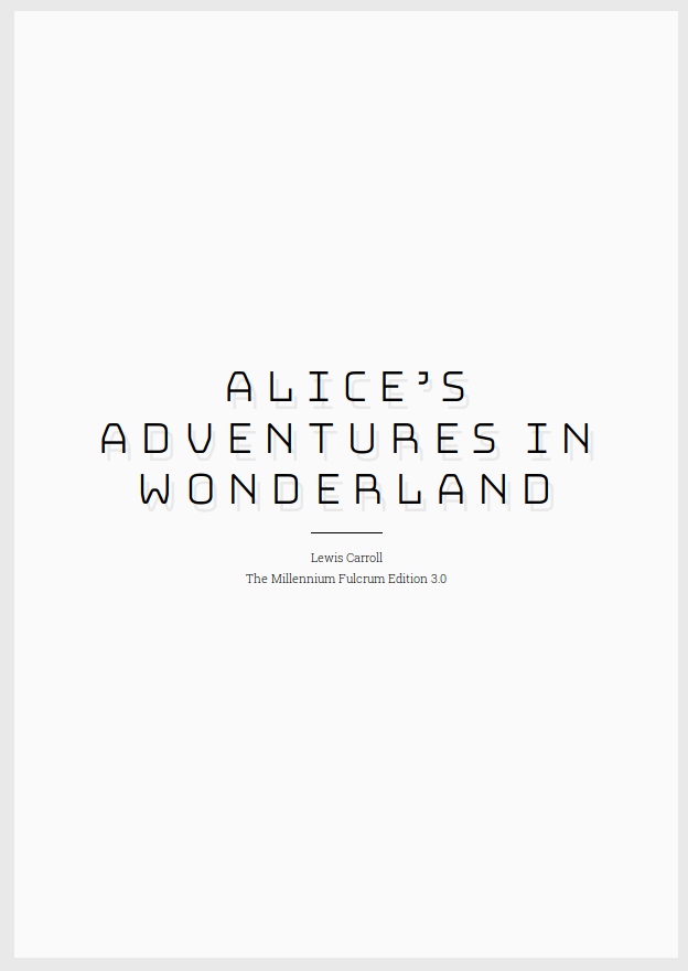
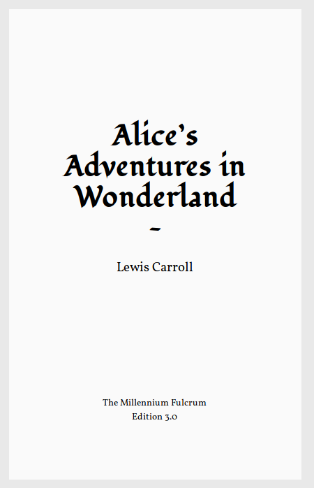
At Electric Book Works, we’ve been making books with HTML and CSS for several years. We use Prince, which is fabulous, but it’s the only proprietary part of our workflow. I’m very excited about PagedJS, which could become a real open-source alternative for PDF rendering in professional book production.
A key element of making this happen is to get more people using paged.js, and learning how to create book designs in CSS.
With Adam Hyde’s encouragement and funding from the Shuttleworth Foundation, we’ve been working on a little framework to make that easier. The basic idea is to create themes that anyone could use and adapt for their own book projects.
You’ll find it at paged.design. After creating an initial version, we recently ran an in-house workshop with our editorial and design team to test it out.
- We identified several places where the instructions and code needed improving or extending. Hooray for real user feedback! I’ve made many changes to the documentation and repo structure as a result, and we’ve logged some issues for future development.
- The fundamental approach/structure of the framework was easy to grasp and work with. I went in wondering if the framework might be too abstract: would those new to Sass follow how it works? I was happy to find that this was not an issue at all. We just needed to make sure the instructions made it easy to start working.
- It wasn’t yet clear to everyone how they would actually use a theme in production – in a real book project. Would they put their production HTML in a copy of the framework? Or use the framework separately, and link to the CSS it builds? We wondered if we could structure the framework to plug easily into other HTML-based workflows: as in, ‘just drop this folder into your repo’. So I restructured the framework completely to make it possible to drop a theme folder into an existing project, and still customise that theme in place.
- The clearest feedback was that working with the framework, and
paged.jsin general, was an excellent way to learn Paged Media CSS. I wasn’t expecting this, but it’s a great point: the instant feedback that designing in the browser provides is immensely rewarding, and the existing variables and partials in the framework are educational in themselves. The framework may be most useful as a teaching-and-learning tool. - In addition to that, most non-developer designers prefer to lightly adapt existing book designs, and not develop their own from scratch. This reminded me of how so many beginner web-developers start out by tweaking CSS in WordPress themes, and do so for months or years before trying anything more ambitious. Learning opportunities like these are critically important in a new community.
The paged.design project is still a proof of concept. So we would love input on how it works and what it might become. Do give paged.design a spin and let us know what you think.


