These are slides and notes for a presentation I gave at a Paged Media meeting in Boston on 9 January. The meeting, organised by Adam Hyde and funded by the Shuttleworth Foundation, aimed to kick-start an open-source community centred around book production using CSS Paged Media. I gave participants an overview of the use of HTML and CSS Paged Media to produce print books in particular. Erich van Rijn from the University of California Press has written a good overview of the event.
Fire and Lion is a team of five people based in Cape Town. We have one front-end developer (that’s me), two designers, and two editors.
What we do
We make books for publishers and for organisations who need to act like publishers. And we produce many of those books in multiple formats: print, epub, website, and app.
I’m going to go through some examples of books we’ve produced, and highlight some of the key features we need for printed books in particular.
Then I’ll talk about some of the key challenges we’re tackling in making books this way.
I won’t be talking about why we’ve chosen to make books this way. Those in this room already have good reasons for choosing to use Paged Media for book production, and I’ve written about our thinking on this elsewhere.
Beautiful typography
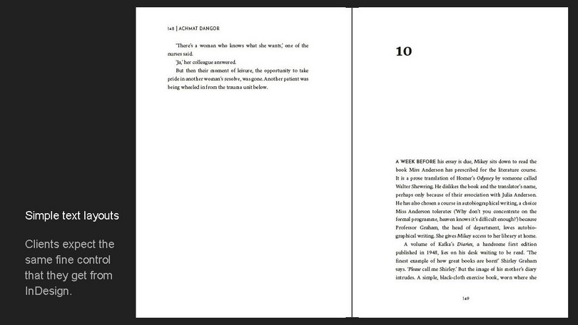
For many of our clients, their priority is a great-looking book, not a digital-first workflow. So they expect the same degree of customisable, fine-grained typographic and design control they’ve come to expect from InDesign.
So we need to be able to produce beautiful typography…
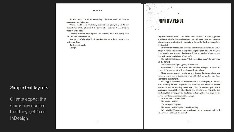
… and design effects like the spattered-ink effect in this novel, Knucklebone (Pan Macmillan). In our source files, we use an SVG here, placed with position: absolute. We then have four spatter variations that we alternate between chapters.
Images and colour
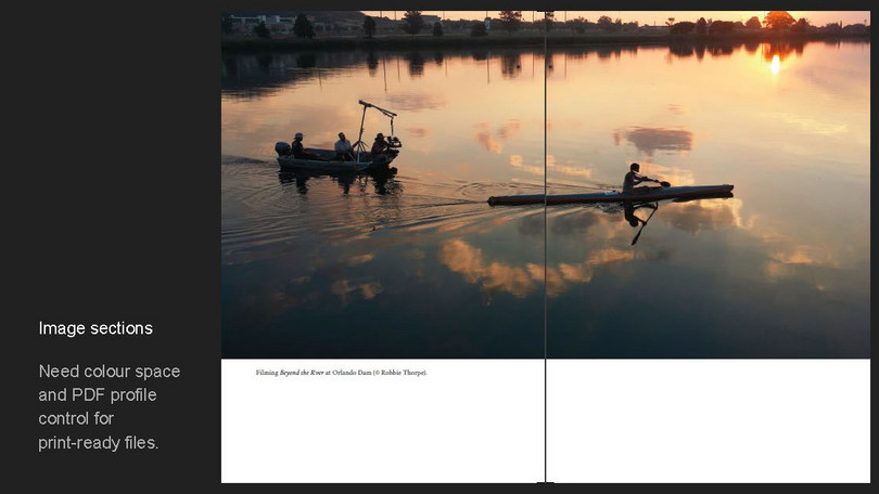
We also need to be able to create picture sections, and for those, we need to be able to control the colour space of the source images and output PDFs (CMYK or RGB, depending on our output intent) and the PDF profile (X-1a for print PDFs, A-3b for screen PDFs).
Recreating baseline grids
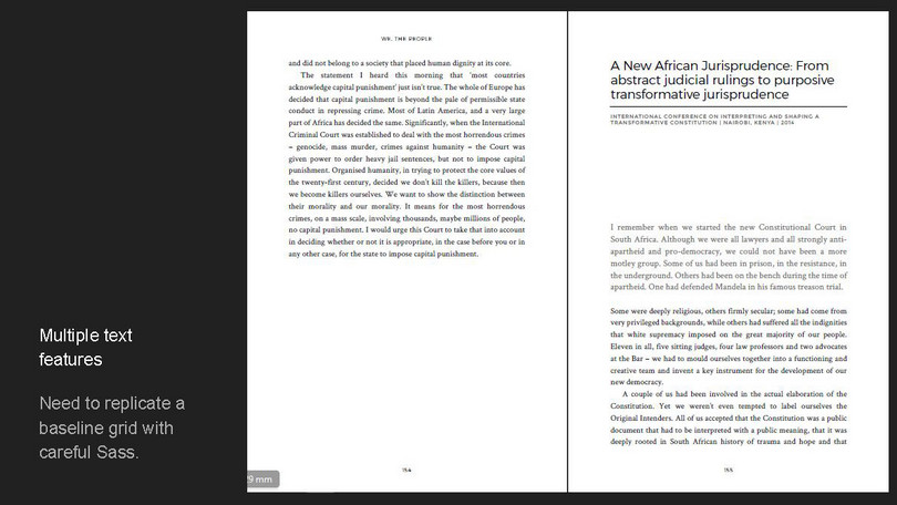
Part of being a good CSS book designer is appreciating the importance of things like a baseline grid. In InDesign, a baseline grid forces all lines to fit onto a specific measure – say, 14pt – so that lines on opposite sides of a spread, and opposite sides of a leaf – line up exactly.
In CSS, we don’t yet have a similar automatic mechanism, so measures in our book designs have to be carefully calculated from a default line-height in order to fit to that line-height as if it were a baseline grid.
Poetry layout

One of my favourite obsessions is good poetry layout. HTML has no native elements for marking up elements of poetry. Usually, poetry published with HTML and CSS lacks some important best-practices, like aligning a poem horizontally on the page on its longest line.
We’ve had to develop clever ways to control this alignment, as well as manage special indents, white space, runover lines, and mid-poem page breaks.
Data-based books
Most of our books’ content is stored as markdown, a plain-text syntax that is easy to learn and edit.
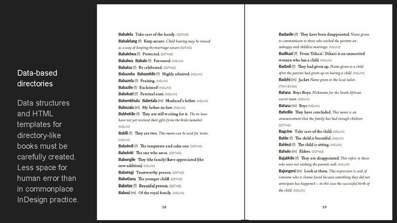
In many books, much of the content is stored as data, either in YAML or CSV format. This book, Jabulani, is a directory of African names. The names are all stored in a YAML file, which is a kind of plain-text, easy-to-edit database. We use a small code snippet to run through the database and add the entries to a document. Because our snippet marks up each piece of the entry, we can control the typography of each element in one place.
Were we producing this book traditionally, we’d have to manually mark up every entry in InDesign, which would be tedious and prone to error.
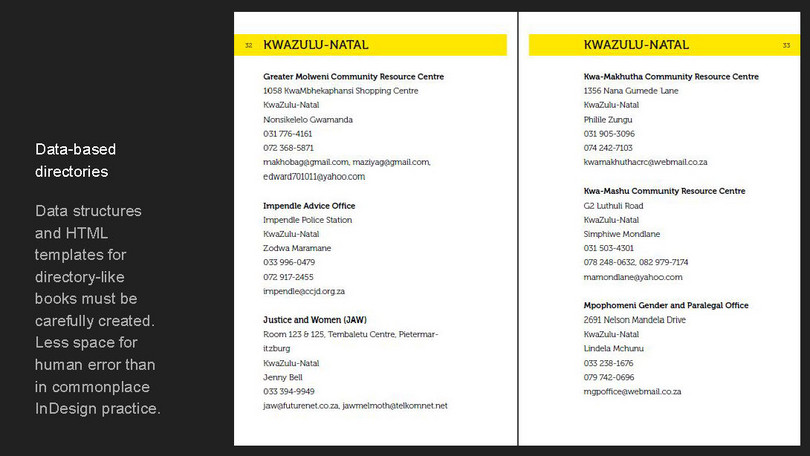
This is another book produced in the same way: YAML + HTML template = directory. This makes producing searchable, sortable website and app versions very easy, too.
Translations and neglected languages
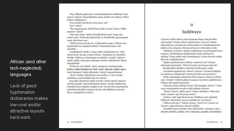
We’re also producing more and more translations, especially in African languages. Our industry has a long way to go to produce tools for laying out neglected languages well. In particular, we need good hyphenation dictionaries for languages like this one, Xhosa, which is a major South African language.
For this book, we developed our own small hyphenation dictionary to improve linebreaks and page design, but it’s really only a small start. Greater adoption of digital-first publishing workflows would enable us to be part of open-source communities for improving layout in local languages.
Variant editions
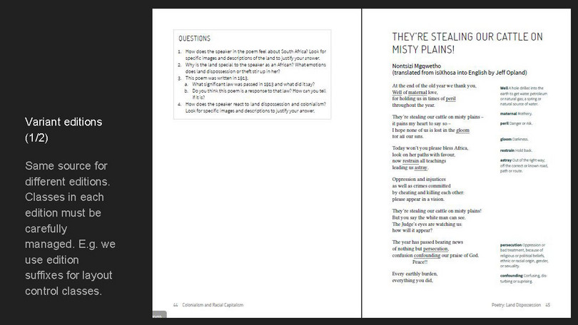
One of the common benefits of digital-first publishing is the ability to produce different editions of the same book. You store the content once, and output it in different editions. Sometimes these editions only differ in page design: for instance, a larger page size and font size for a large-print edition.
We’ve built into our toolset the ability to produce variant editions, which can vary in more ways. In addition to looking different, they can include different content in a different order.
This is the schools’ edition of Amagama Enkululeko, an anthology for schools…
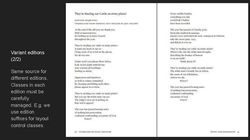
… and this is the trade edition, which does not include the questions and glosses, and has a more conservative design.
We use Sass variables to apply different suffixes to layout-control classes for each edition.
Complex textbooks
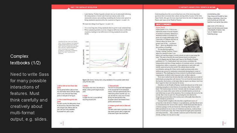
The most challenging books to produce with HTML and CSS are complex textbooks, such as The Economy, which we produced as a website and a print edition for CORE, with the print edition published by Oxford University Press.
Here we started with our existing library of styles for basic book production, and then wrote thousands of lines of custom styles to create the page layout and allow for the many possible interactions that might appear in the book. For instance, a paragraph has to know when to be indented and when to be flush left, depending on which elements precede it in the HTML.
Here, we relied heavily on PrinceXML’s awareness of inside and outside for rules for margins and floats, which are critical for creating a mirrored-double-page-spread design like this.
Planning for different formats
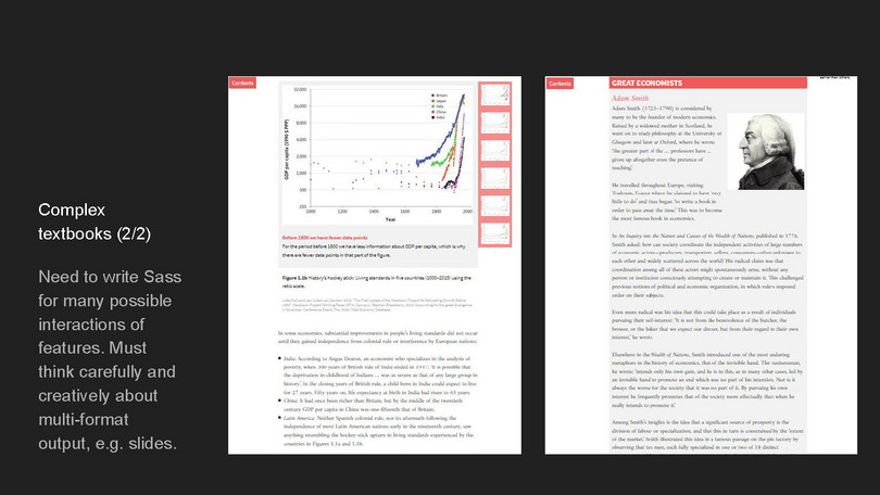
Perhaps the biggest challenge with this book was to keep in mind that it would be a website and a PDF. Each format needed to be built from the same source, but needed to behave differently.
For instance, on the website many figures are interactive, clickable filmstrips, so instead, in PDF we show a single, summary image with numbered blocks of text below for each slide in the filmstrip.
We also had to develop convenient ways to display certain hyperlinks as page numbers and visible URLs in the print output. Thanks to CSS Paged Media, these page references are entirely dynamic: if we add text that causes pages to reflow, the page numbers will update automatically.
Our workflow
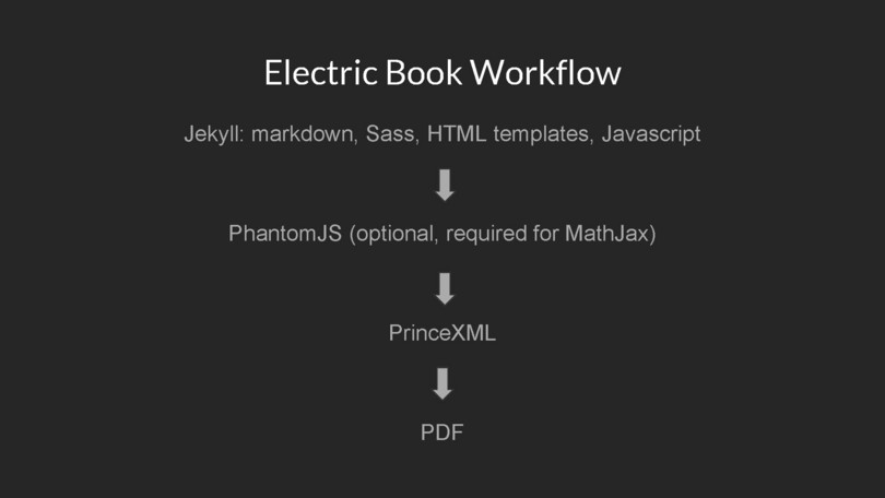
We call our process the Electric Book workflow. In this workflow, to produce PDFs:
-
We create:
- content as markdown, YAML or CSV files
- styles as Sass
- HTML templates using Liquid
- and a little extra magic using Javascript.
- We use Jekyll to turn that into a static website.
- If our content includes maths, we might run that HTML through PhantomJS to render MathJax.
- We pass the HTML to PrinceXML to convert to PDF.
Each project is stored and version controlled in Git, and usually hosted on GitHub.
For our other output formats (epub, web, app), we just run Jekyll with a different configuration. Many of our templates are aware of the output format we’re building for, and they adjust the HTML they output accordingly. For instance, in print, a video will appear as a thumbnail and caption; whereas on the web, the video will be clickable and will stream directly from, say, YouTube or Vimeo.
Defaults, variables, and custom styles
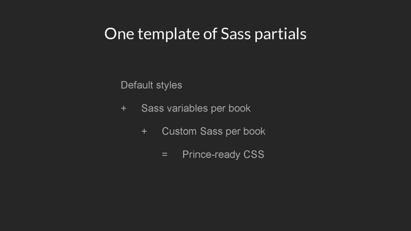
To make designing a new book efficient, we start with a library of default styles which are written in Sass. These define what we’d call basic book-design best practice – a vanilla book.
When compiled as CSS, these styles are several thousand lines of code, so there is a fair bit of complexity there. But that’s what two-thousand years of book design will do.
For each book, we can set about a hundred book-design variables that feed into the compiled CSS. These include things like page height and width, PDF profile, fonts, colours, and the behaviour of running headers.
And then we almost always add custom CSS for each book, often for bespoke features such as chapter openers or brand-specific title pages.
When Jekyll runs, it combines the default styles, variables, and custom CSS into one CSS file that PrinceXML uses to lay out the pages in PDF.
Key challenges
I love the many small, technical puzzles that designing books with CSS presents. There are also some much bigger challenges that we’re tackling, and where community effort might go a long way.
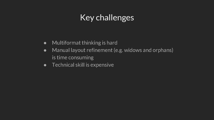
First, multiformat thinking is hard. The whole point of our digital-first approach is to store content only once, and produce multiple formats automatically. This puts tremendous pressure on project managers, developers, authors, editors, designers and proofreaders to think in multiple formats at once.
For instance, on the web, hyperlinks are cheap: you can add them anywhere, attach them to any text, and the design can keep them out of the reader’s way. In print, hyperlinks vanish or, if presented as page numbers, take up space and attention. Another example I mentioned above is interactivity: the text in the filmstrip figures in The Economy has to be sensitive to the fact that readers might be looking at clickable slides or at a static, printed page. And when controlling the flow of text, editors have to be aware of things like what happens when an element is floated: it appears beside the text it precedes in HTML, which can be counterintuitive for things like sidenotes beside paragraphs.
Like many publishers, we’ve had to invest a lot in training our team in multi-format thinking.
Second, manual page refinement is time-consuming. Automated layout with CSS gets us far, taking care of perhaps 90 per cent of a traditional typesetter’s role. But after that a human still has to check every page and refine many of them. On The Economy, I spent three or four hours on each chapter making small tweaks to get figures and sidenotes to fall in just the right place for maximum readability. On most novels, we spend at least three or four hours manually adjusting letter-spacing and soft hyphenation to avoid bad breaks, widows, orphans, and short lines.
If there is one thing we need better automation for, it’s proper, typographically sensitive widow-and-orphan control.
Third, technical skills are expensive. Extraordinary demand for developers worldwide means that dedicated technical team members are completely unaffordable for most publishers. If you’re going to create books with HTML and CSS, you need technical skills on the team, either in-house or in partnership with an outsourced team you can really trust.
In our team, we dedicate a significant piece of everyone’s time to technical skills development – both editors and designers – to reduce dependency on developers. And, as our technical lead, I have to spend at least half my time learning or training others. A commitment to digital-first publishing is a commitment to a serious learning curve.
New non-technical tools
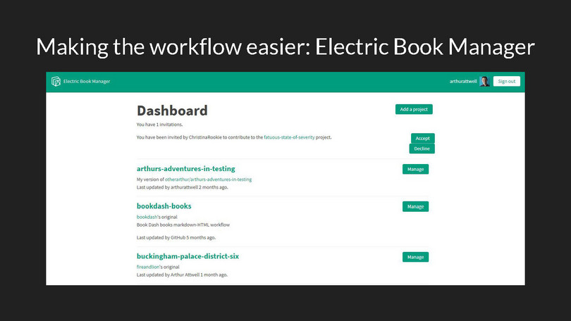
One way to reduce dependency on developers is to build tools to do the heavy lifting. With generous support from CORE, we’ve developed the Electric Book Manager as a web-based interface for our workflow.
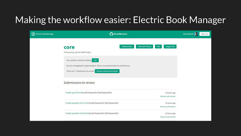
On an EBM, non-technical users can edit text, output PDF and web versions of their books, and collaborate on editing. The EBM stores each user’s copy of the project in their own GitHub account, and behind the scenes uses GitHub pull requests for collaboration and review.
This Git-based collaboration is often crucial. For instance, when we produced the 1500-page book The Economy in under ten months, we had four editors and two designers working on the same files at the same time, something that would have been impossible in a traditional workflow.
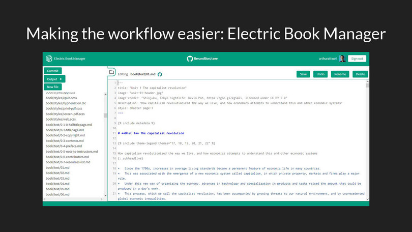
The EBM is very early, alpha software, and we’re using it with selected clients to let them edit their own books directly. Like our Electric Book Jekyll template, it’s also Open Source.
I hope that, in time, it forms the bridge we need between technical and non-technical team members who need to produce multi-format books faster and in teams.

A great post for a great project! Thanks Arthur!
I have two questions :
- today Hugo (a fast static site generator) seems to be faster and more flexible than Jekyll, would it be relevant to use Hugo in your workflow?
- do you think that a web-based editor (like forestry) can manage the contents like your Electric Book Manager?
Thanks, Antoine.
I haven’t tried Hugo yet. I’m very tempted, but realistically I’m unlikely to find time soon, and we are very deeply invested in the Jekyll setup, particularly its integration with GitHub Pages. One of the challenges with using a given tool for real client work – at least when you’re a small team like ours – is that you have to stick with your early decisions, and you’re unlikely to get a realistic chance to revisit them.
I also haven’t tried forestry myself properly. I can’t see any reason it wouldn’t work as a convenience for semi-technical Electric Book users. The difference with the EBM of course is that the EBM is designed specifically for non-technical users editing books, so it deliberately hides a lot of complexity that a more generic Jekyll admin interface might need to provide.
As far as I can tell, forestry, cloudcannon and siteleaf are not open-source, which is another important consideration for us. I don’t think any publisher trying new things should risk using proprietary tools right now. With open-source, you’re not going to get locked out of your toolset if its owner’s business model changes.
We originally considered building the EBM on top of an existing open-source Jekyll manager, but couldn’t find one that was established enough and open-source. Prose of course influenced our thinking, and the jekyll-admin plugin looks promising.